You have a great product; your price is competitive, customer service second to none. Yet you are wondering why your eCommerce store is converting only 1.2% of customers into buyers.
You configured funnel visualization in your analytics and determined the most pressing problem. It’s your product page.
85% of your customers landing on product pages but aren’t adding your awesome products to the shopping cart. Thus you want a magic button to fix all your problems.
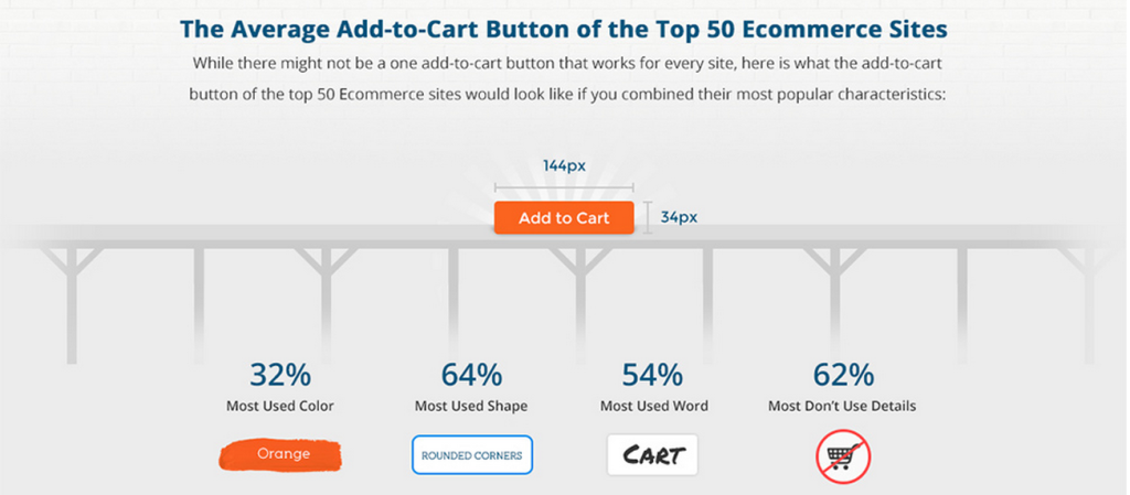
If you take a look at the average Add to Cart Button of the top 50 eCommerce stores you’ll get an orange, rounded button with the “Add To Cart” text.

Image Source: Volusion
The Simple Solution To Increase eCommerce Revenue
Q. So if I change my button color to orange I will increase my revenue by $3,000,000?
A. No.
Q. What about red, I heard red works?
A. No.
Q. Well why am I reading this article?
A. Because you can do better. You don’t settle for the average 1-2% conversion rate, you want to make the most out of the traffic you spend so much $$$ to acquire.
Q. Well doesn’t that take patience and a through understanding of why customers want to buy from me?
A. Yes.
Analyzing Button Color A/B Tests

Though the green might draw more attention the clear winner here is the black and yellow button with a 14.5% increase in conversion Image Source: Unbounce

In this A/B test the red button increased conversions by 21% compared to the green button.
So Orange > Red > Blue > Yellow > Green ?
Not necessarily. What I found was that so many blog posts including mine are recycling A/B test studies. Rarely ever do we see tests that are inconclusive.
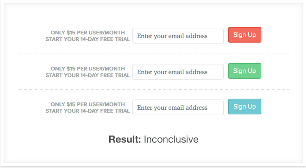
Groove tested their “Sign Up” button and it did absolutely nothing for them.

Image Source: Groove HQ
Another example the team at Monetate furious with all the hype behind orange buttons argued that most of the orange buttons were tested against no control. The control had no button so any button would improve the results. In this test their client saw a 9% lift with a blue button vs the orange.
Image Source: Monetate
The $300,000,000 Button
Sorry to break it to you but when Amazon increased their revenue by $300,000,000 it wasn’t a mere color change. They tackled the underlying issue that hindered conversions.
Most shoppers don’t want relationships. Shoppers want to buy the product, and have it shipped to their doorstep. Why force registration and lose sales?
Thinking they were making the process easier for repeat buyers and that new buyers wouldn’t mind registering was a fatal mistake made by the designers. First time buyers opposed registration and returning customer couldn’t remember their email or password (an examination of the retailer’s database, proved that nearly 50% of customers had multiple accounts).
Replacing  With
With
(You do not need to create an account to make purchases on our site. Simply click Continue to proceed to checkout. To make your future purchases even faster, you can create an account during checkout.)
Resulted in an additional $300,000,000 in purchases the first year.
Orange vs Red vs Blue v Yellow vs Green ahh What Color Do I Choose?
Well it’s not just about colors. It’s about understanding your customers. It’s not about mind games and tricking your customers to click. You need to speak their language and deliver value on their own terms.
Test constantly and test with a purpose but mostly test with your customers in mind.
Do you have any insightful eCommerce A/B Tests that you would like to share? Please do so in the comments below.
