Trying to get your responsive email template underway isn’t always an easy task. There are several things to consider. The way you markup your template, and the CSS properties used, can significantly alter your email display across multiple clients.
I’ve been building responsive websites for years but recently started exploring responsive email design, and began to search for some simple techniques that’ll get any template designer started in the right direction.
1. Tables inside Tables inside Table Rows inside One Big Table!
Ok, that’s not exactly how it goes.. but you catch my drift
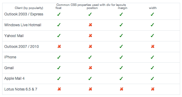
The need to use div tags in email (even in 2014) is limited. A study on campaignmonitor.com analyzed the use of div markup versus table-based markup, and tested the results across multiple email clients. The results were messy.. many email clients didn’t render the CSS properties needed for the appropriate display, including the latest version of Outlook.

While the idea of using div tags in email markup is highly frowned upon, there is often a misconception associated with it. Div tags can be useful in some situations, such as the replacement of br and p tags, and can sometimes be used to save time on inline styling.
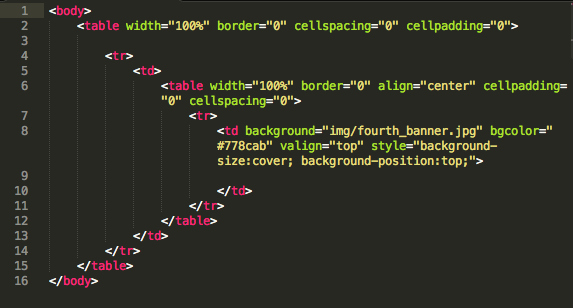
An example of responsive email markup:

The html text in the picture below would nest (in a table) in between the td tag that contains the background image.

2. Say Goodbye to External Style Sheets
In responsive email design, there is no need or use for external stylesheets
All styles and media queries should take place in the head of your html document.

3. Mobile First, Always
Start with the smallest device resolution
If you’ve ever messed around with responsive design before, you know that when a small device zooms out to catch up with a wide layout, the text is impossible to read. We combat this by adding a media query.
In responsive design, we know that the smallest device screen to consider is the iPhone in portrait mode.
The width of an iPhone in portrait mode is 320px wide. So we’ll use this as our starting point and account for all device widths that are greater than 320px but less than 480px.

4. Declaring Classes
Responsive design means that you’re dealing with tables, and dealing with tables can sometimes be confusing for beginning developers (as weird as it sounds).
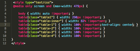
The way to manage your classes within your media queries, is to set the class name to the html element associated with it. For example, here we have multiple tables within our 480px media query. Notice how some tables need to span the entire 100% of the device, and others less.

5. Size Matters
A good call-to-action can be the difference between click throughs and abandonment.
In addition, proper font-sizes and button sizes need to be considered..
For mobile design, an absolute minimum font-size of 16px is recommended.
Apple suggests a font-size of 17px – 22px, and Google suggests 18px – 22px, with the call-to-action being at least 46px in height.
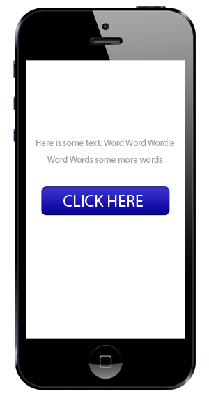
The best way to ensure that your call-to-action is sufficient, is to put it through the squint test. If you or someone else can still tell what the call-to-action is when you’re squinting, you’ve passed the test.


I’ve been doing this for about a year, anyone that wants to share their expertise id love to hear about your responsive email success.
